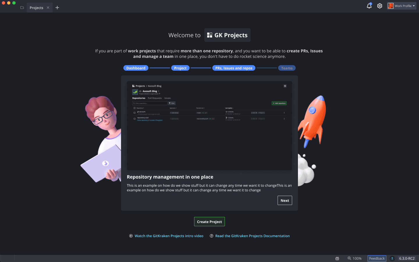
The world's most powerful suite of Git tools.
Client → Axosoft LLC
Challenge and Outcome
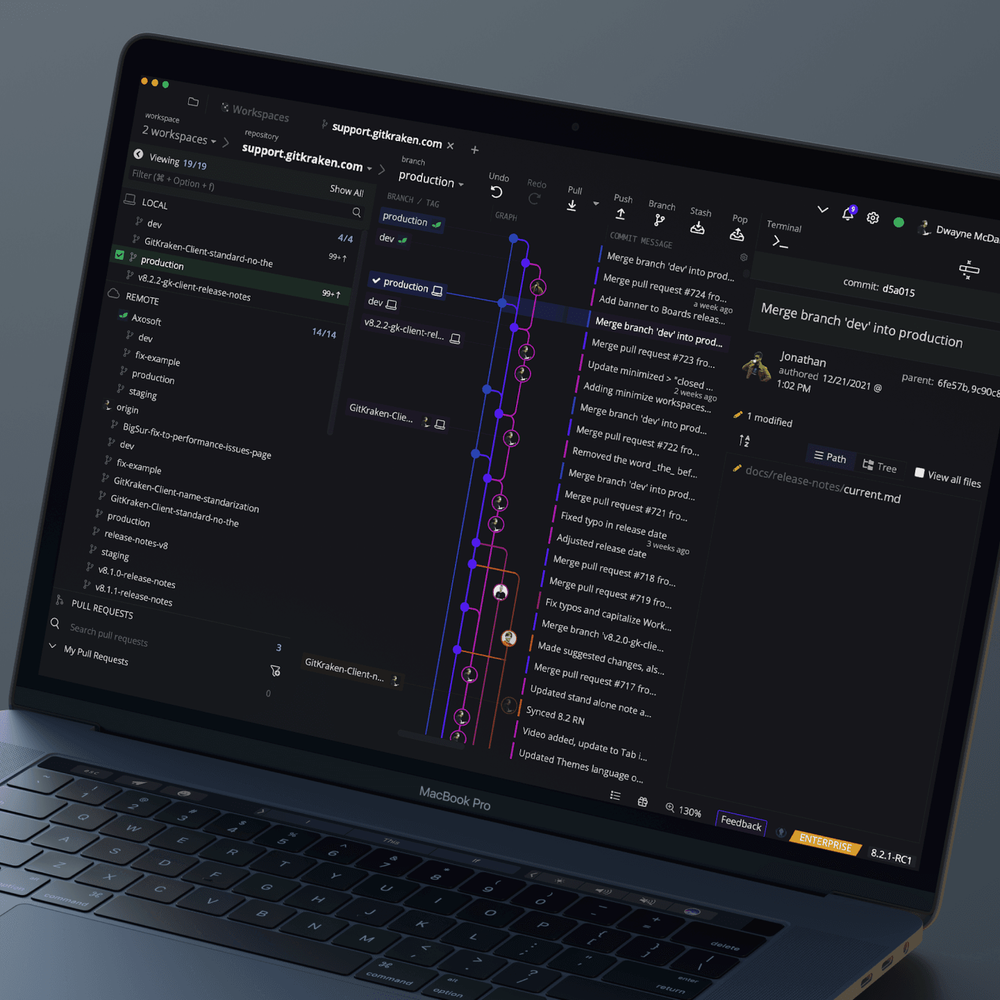
The GitKraken Client underwent a major transformation with the renewal and creation of key features such as Diff View, GitGraph, and Workspaces. These improvements not only enhanced the platform's usability and visual cohesion but also caught the attention of Resurgens Tech, solidifying GitKraken’s position in the market and reinforcing strategic partnerships, including integrations with Atlassian.
The introduction of a scalable core design system and streamlined handoff protocols significantly improved the consistency of the User Interface (UI) and Developer Experience (DX). Additionally, atomic design principles guided the development of front-end components using ReactJS and Electron, ensuring a flexible and scalable foundation for future growth.
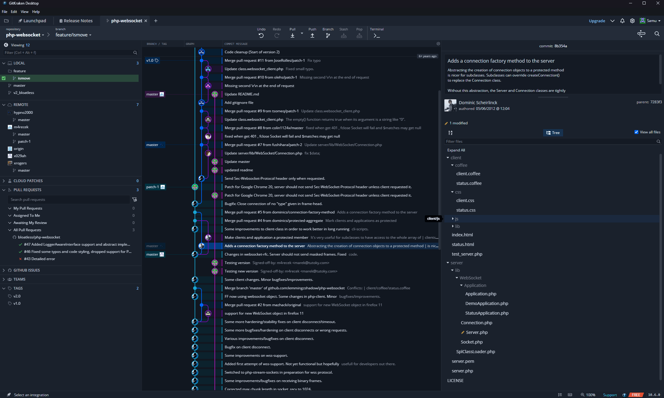
Working on the Graph
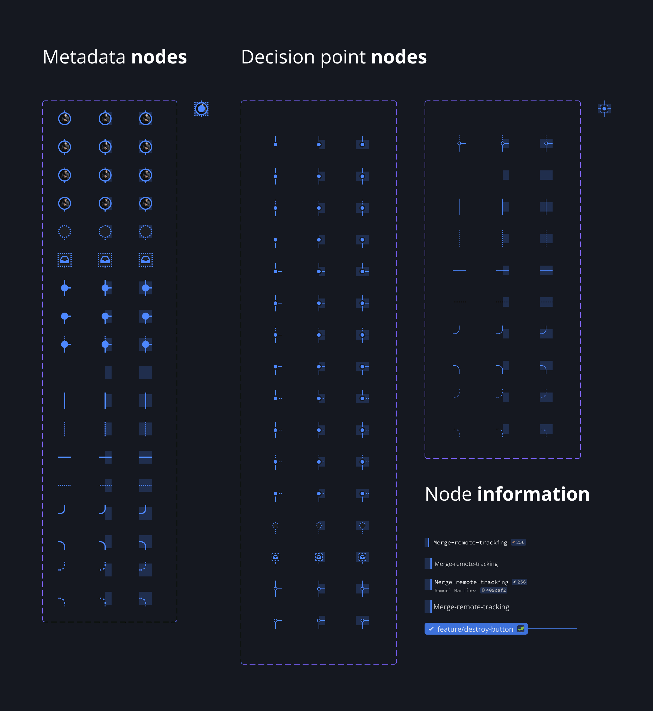
A central element of GitKraken’s functionality is its Git graph, which required a complete systematization to enhance flexibility and usability. The project began with a detailed audit of all node types, variants, and graph configurations. Based on this analysis, a procedural layout system was developed, allowing for the creation of modular and reusable components that simplified graph construction. This system provided a semantic, "Lego-like" building experience, making it easy for developers and users to adapt the graph to various workflows and visual styles.
The resulting Git graph system was not only visually consistent but also highly adaptable, supporting multiple use cases without compromising on clarity or functionality.

Decision node: A block that makes able to create different decision in graphs.

Meta node: A block that allow to describe the node purpose in graph.
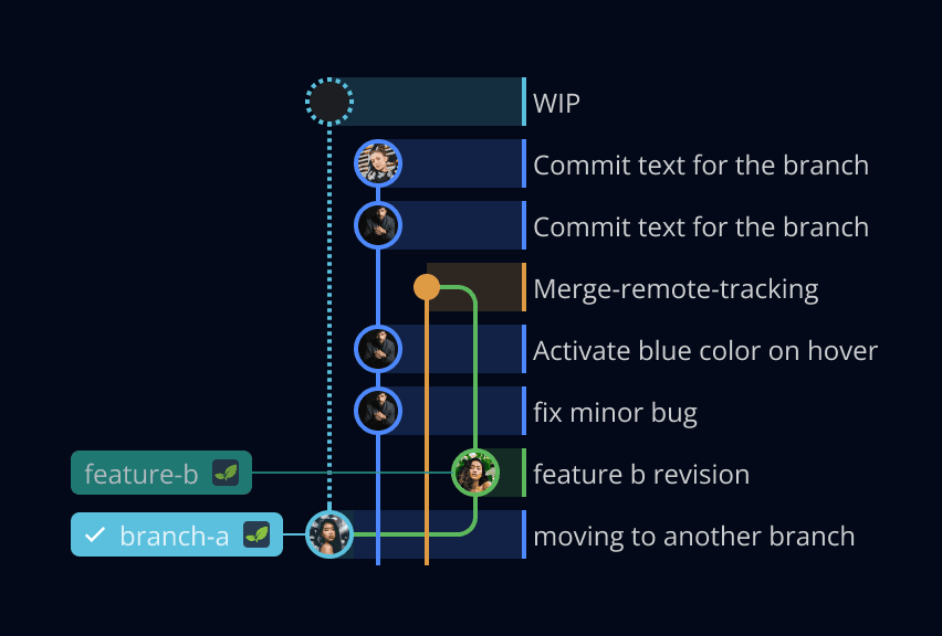
An example of a composed graph, lego-brick like.
Information Architecture in action
The New Window landing page presented significant usability challenges due to its complex navigation and scattered information hierarchy. To address this, a complete restructuring was undertaken, guided by the eight principles of information architecture. Over six iterative design cycles, the layout was refined to ensure intuitive navigation, logical grouping of elements, and clear prioritization of information.
The final design provided users with a seamless entry point to GitKraken’s core functionalities, making navigation straightforward and significantly reducing cognitive load. This redesign greatly improved the overall user experience and enabled faster access to key tools and resources.
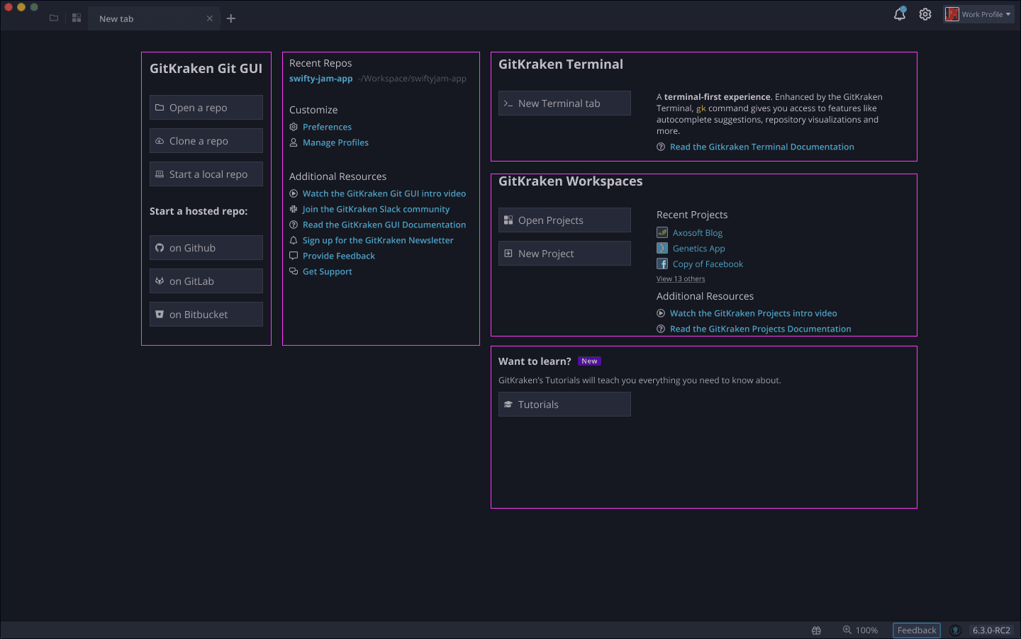
Iteration 1: Finding and grouping the current elements in the New Window.
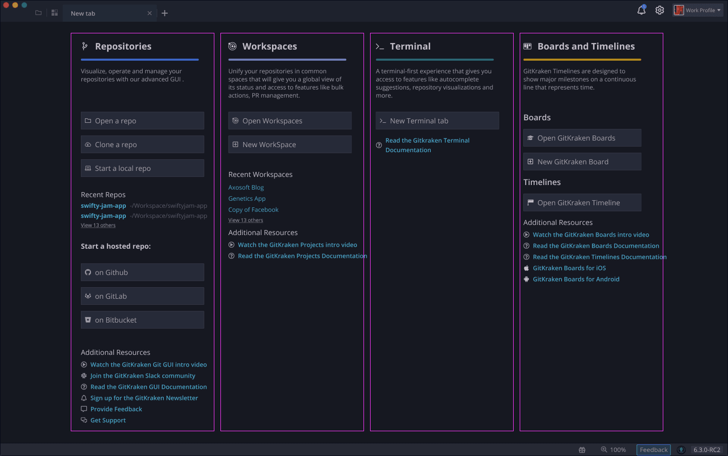
Iteration 2: Defining relevance of elements and hierarchy.
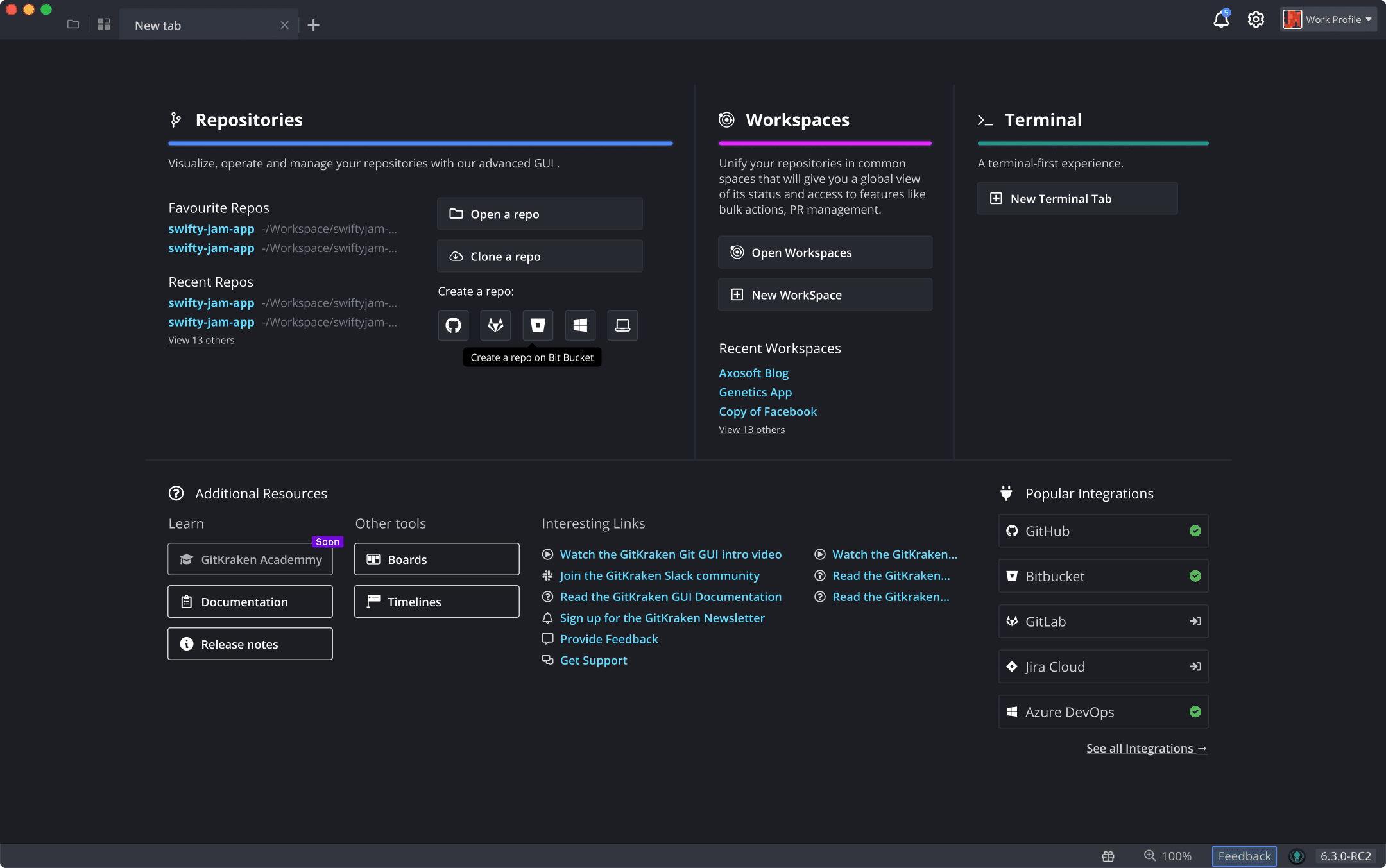
Iteration 6: Final version with the content divided in sections, each with its relevance and taxonomy properly grouped.
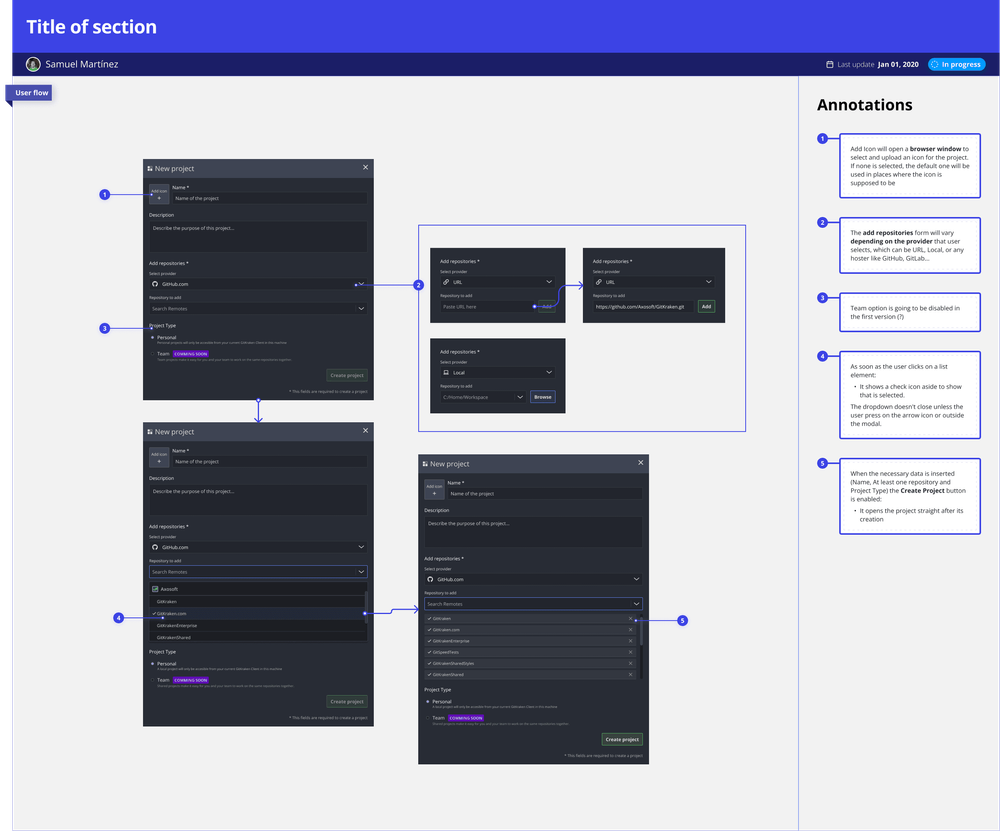
Workspaces with ease
Workspace creation and management were identified as complex and error-prone tasks, requiring a more intuitive and user-friendly solution. A granular onboarding process was implemented, breaking down the workflow into smaller, digestible steps to minimize cognitive strain.
The workspace creation form was made interactive, dynamically adjusting options based on user input and providing immediate feedback to guide users through each stage. This approach not only reduced user errors but also ensured a smooth and confident onboarding experience, transforming a previously overwhelming process into one that felt natural and manageable.
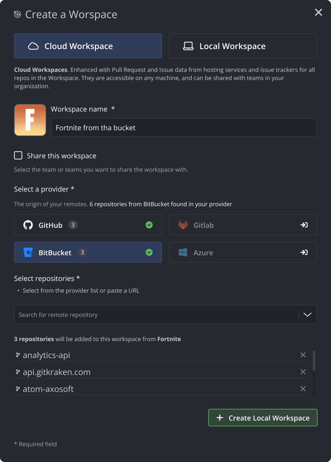
An example of a complex workspaces creation form, reactive to the options proposed by the user,
Onboarding step, part of the workspaces onboarding flow.
Strategy
The strategy centered on redefining GitKraken’s design system to ensure consistency and scalability while supporting the platform’s rapid evolution. A key focus was the creation of a new handoff system to bridge the gap between design and development, ensuring clear and precise communication of design specifications. Information architecture played a crucial role throughout, guiding the organization of content and the structuring of workflows to enhance usability. Additionally, the approach prioritized minimalism at the atomic level of the UX, reducing visual clutter and maintaining clarity as new features were introduced. This combination of a cohesive design system, improved collaboration protocols, and a user-centered information structure provided a solid foundation for sustainable growth and an enhanced developer and user experience.