Consistent and scalable: NAX Design System
Client → NAX Solutions

Challenge
NAX Solutions is a forward-thinking agrotech company that leverages satellite intelligence and machine learning to support data-driven decision-making in agriculture. The platform optimizes farming operations by providing real-time data that assists with irrigation, fertilization, and anomaly detection, helping agricultural businesses improve efficiency and yields.
The rapid growth of NAX’s feature set and user base brought increasing complexity to its platform. This expansion highlighted three primary issues:
- Design Process Inefficiencies: Without a formalized design methodology, the team struggled to maintain visual consistency and an intuitive user experience.
- Cross-Department Collaboration Issues: Communication between design and development lacked a structured handoff process, resulting in delays and misunderstandings that impacted product development.
- Visual and UX Consistency: With no centralized system, the platform’s components and screens varied in style and interaction patterns, creating a disjointed user experience that hindered scalability.
These challenges were common in fast-growing tech environments but needed to be addressed to ensure that the platform’s quality and consistency could keep pace with its growth.
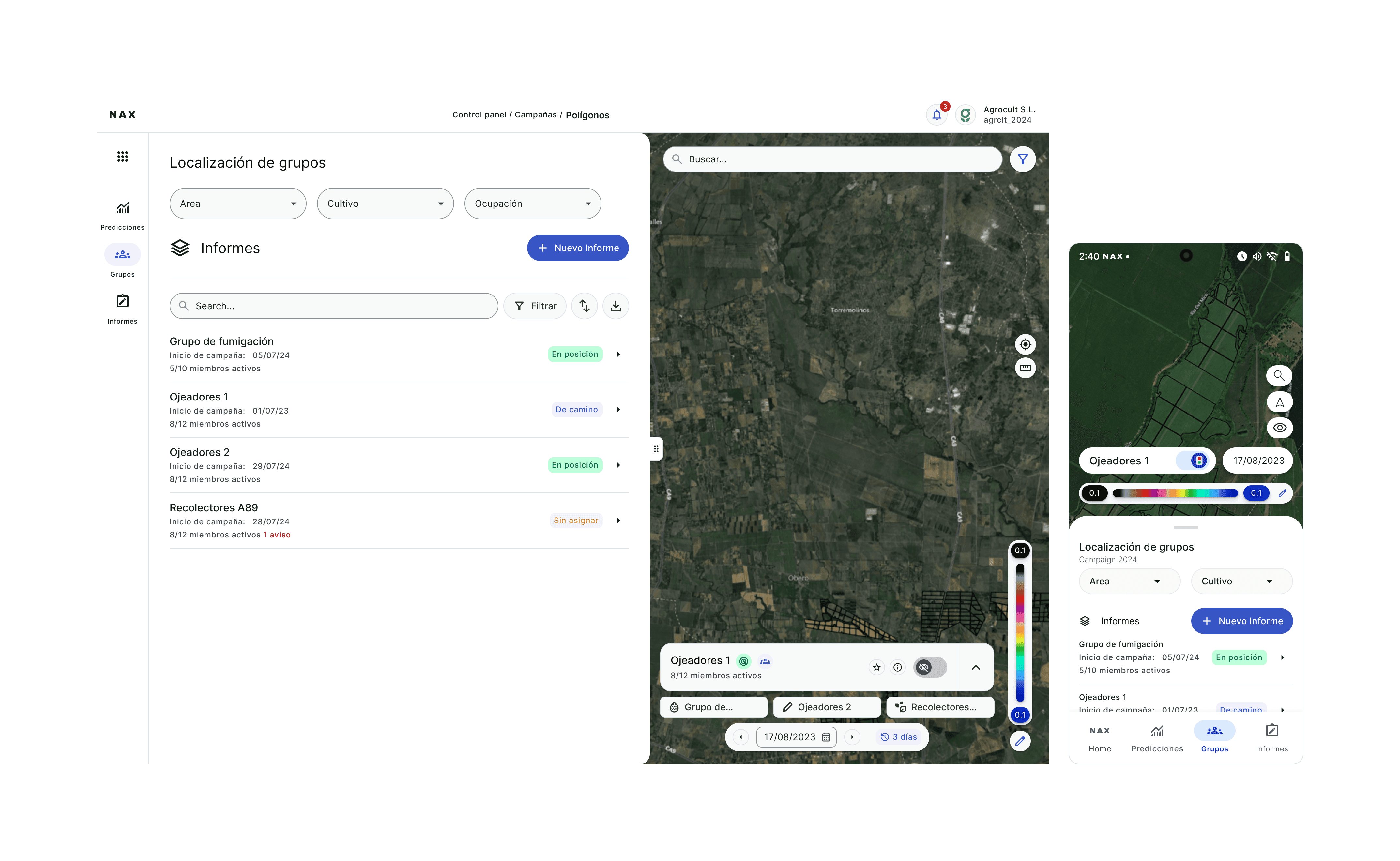
A fully composed map layout with hot swap method
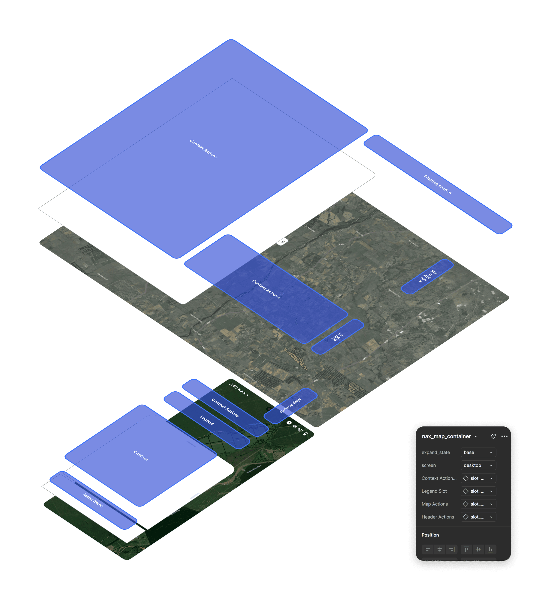
Example of a hot swap based architecture for layouts and components
Strategy
To resolve these issues, we crafted a solution that would not only address NAX’s immediate needs but also establish a solid foundation for future scalability. Our approach focused on:
- Building a Scalable, Token-Based Design System: This system would unify the platform’s interface elements while allowing for flexibility as new features were introduced.
- Developing a Comprehensive UI Kit: Using atomic design principles, we created a set of flexible, modular components that could be easily adapted across the platform.
- Formalizing the Handoff Process: By creating structured guidelines, we streamlined the transition between design and development, ensuring clarity and consistency.
- Implementing Design Ops Protocols: These workflows defined the roles, processes, and checkpoints from concept to deployment, fostering effective communication between teams.
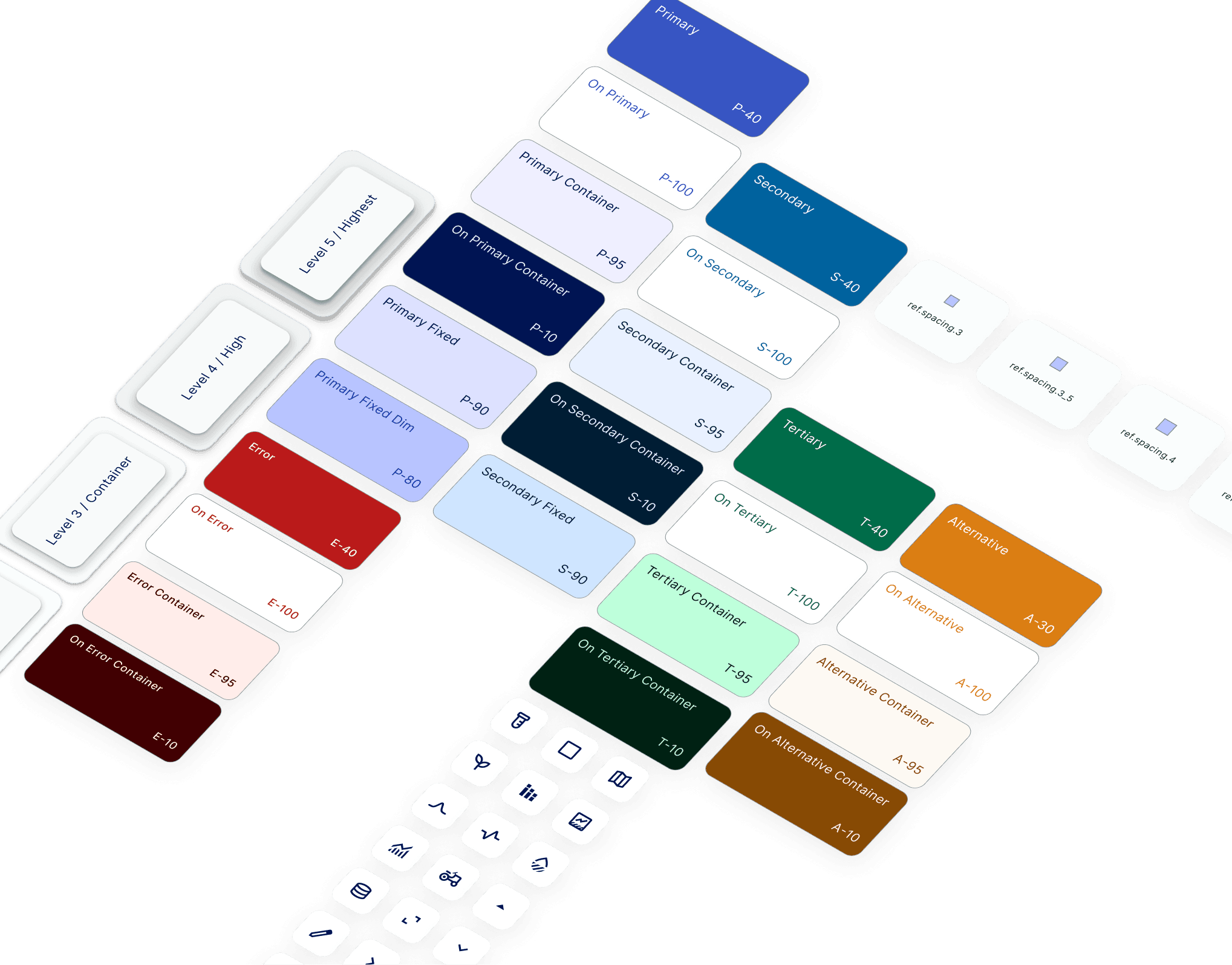
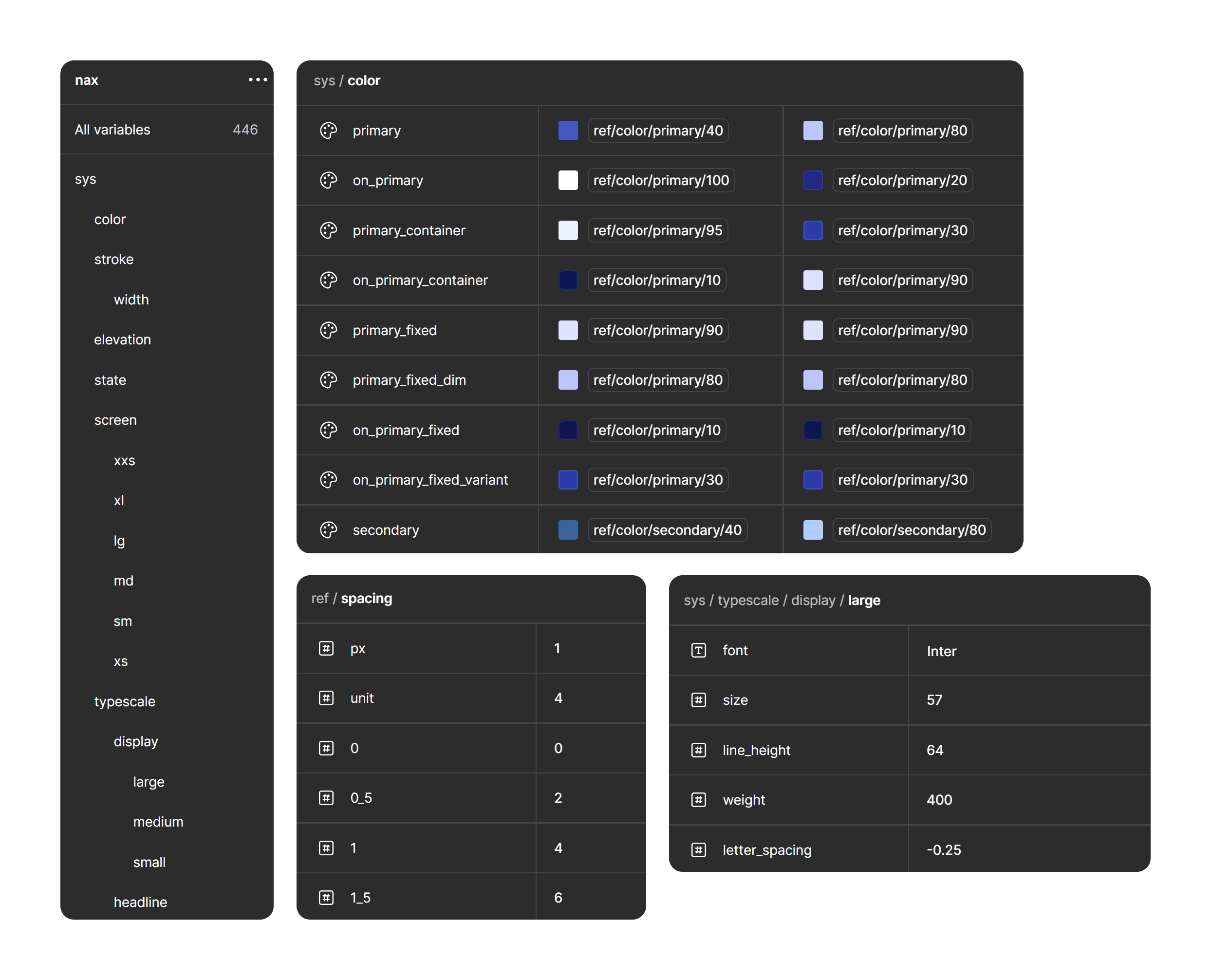
Tokenization adapted to native Figma variable system

Token naming system and multiple tokens placed for testing
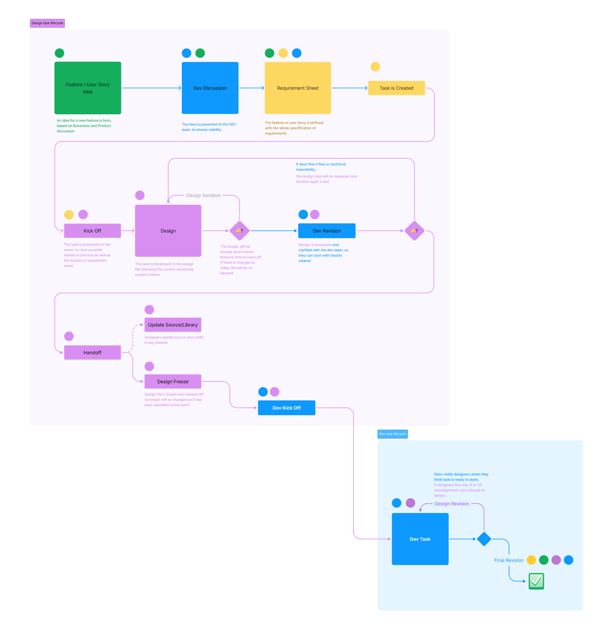
Design Operations schema built with participation of the stakeholders involved
Execution
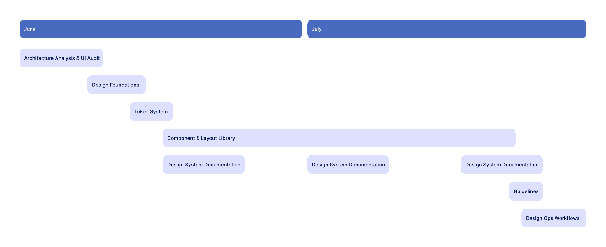
Our work on the project followed a series of targeted steps:
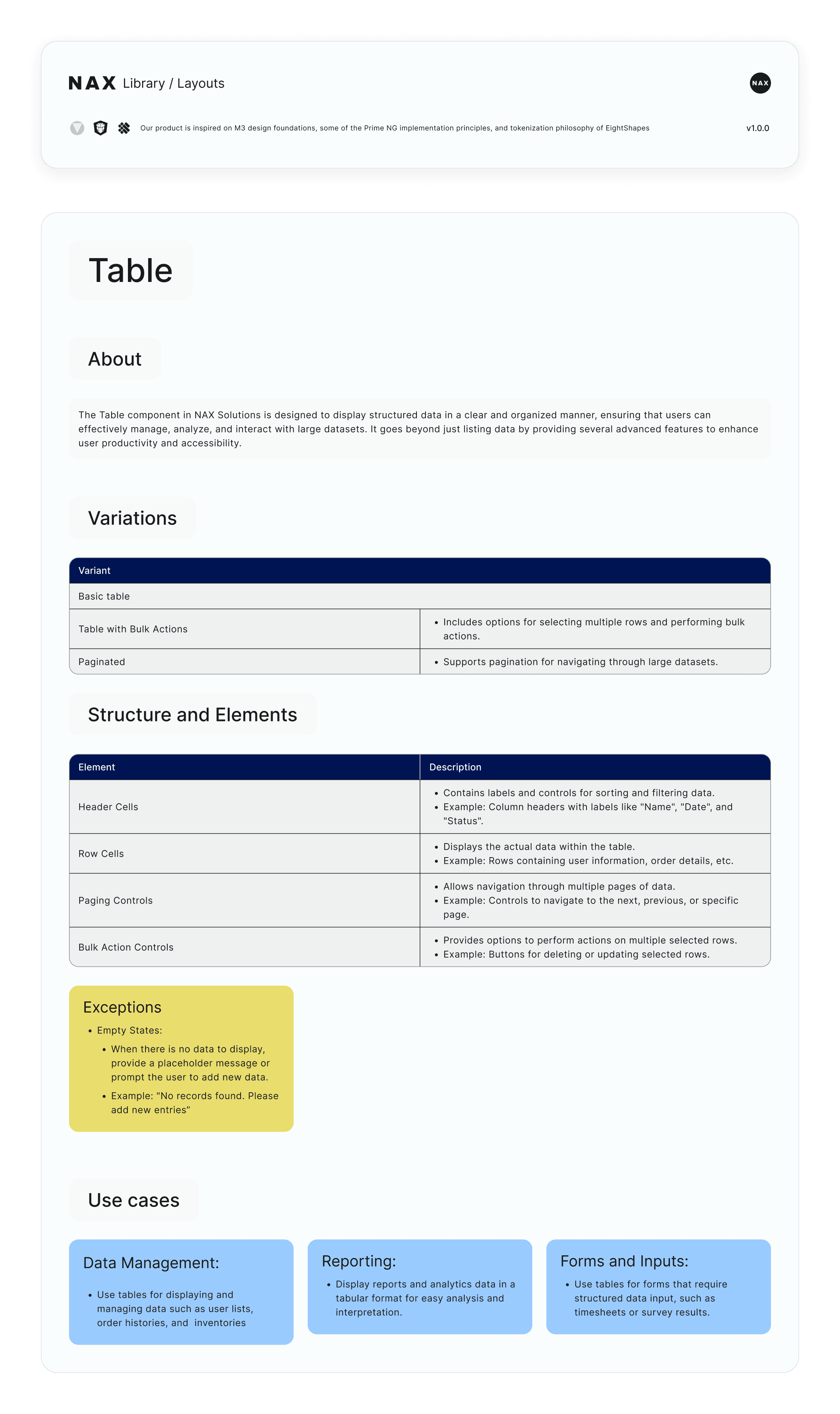
- UI Audit: We began by thoroughly analyzing the existing UI, identifying and cataloging all components, layouts, and patterns. This audit was essential to understand the platform’s structure and identify areas for improvement.
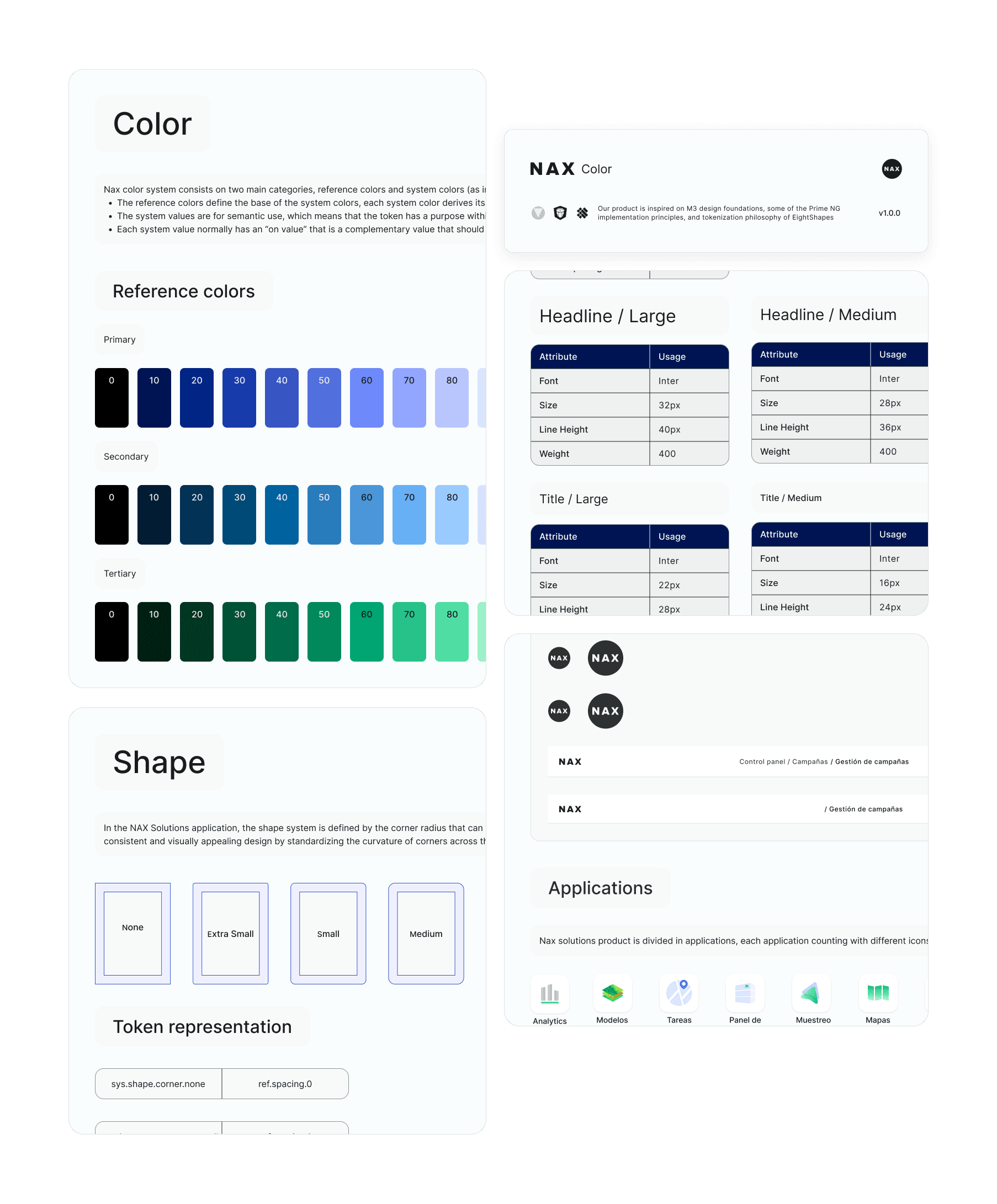
- Design Token System: Using Figma’s native variables, we established a robust design token system that included values for colors, typography, and spacing. This system was integrated with a custom JSON export to ensure synchronization with the development team, providing a source of truth for all design elements.
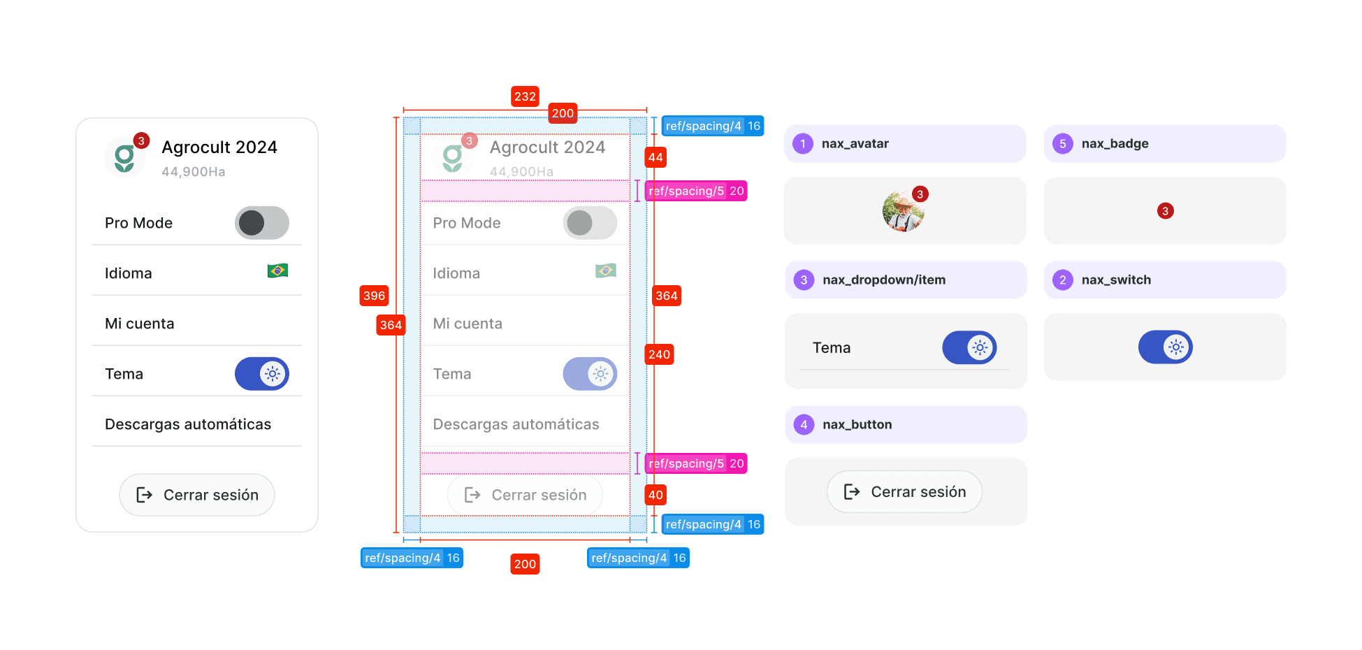
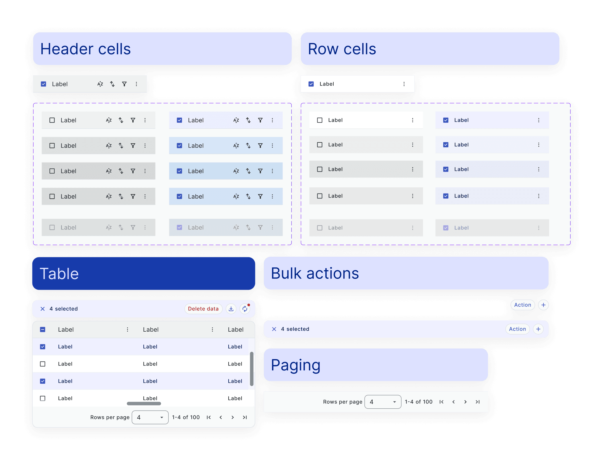
- UI Kit Development: The next step was creating a dynamic, modular UI Kit. Components were designed with flexible properties, variants, and states, making it easy for designers to build interfaces quickly without the need for custom adjustments. This "Lego-like" system allowed for efficient assembly and consistency across the platform.
- Documentation and Handoff: Each component included detailed documentation with guidelines for props, variants, sizes, states, and usage scenarios. Additionally, a library of templates and examples in Figma provided a clear handoff process, reducing ambiguity and ensuring developers had the necessary information.
- Design Ops Implementation: Finally, we introduced a comprehensive Design Ops strategy to maintain continuous feedback and communication between designers and developers. This ensured alignment throughout the project, from ideation through deployment, minimizing misunderstandings and creating a cohesive workflow.
Deliverables
This project produced a set of targeted outputs to address NAX’s specific challenges:
- A complete UI Audit detailing components, patterns, and layouts.
- A Token-Based Design System that ensures visual consistency and supports future scalability.
- A UI Kit with flexible components based on atomic design principles, along with detailed documentation.
- A streamlined handoff system with templates and protocols to bridge design and development.
- Design Ops processes to facilitate smooth workflows and ongoing alignment between teams.
Outcome
The Design System delivered immediate improvements:
- Accelerated Development: With standardized components and guidelines, the development team was able to build and update interfaces more efficiently.
- Enhanced Collaboration: A shared design language and clear documentation fostered better communication between design and development, streamlining the process.
- Improved User Experience: Consistency across the platform’s UI contributed to a more cohesive user experience, enhancing NAX’s ability to scale and deliver a polished product.
Key Learnings
Throughout the project, we gained valuable insights:
- Optimizing Figma for Performance: Managing Figma’s limitations with large-scale components was essential to maintaining flexibility without sacrificing speed.
- Navigating Figma’s Native Token System: While working with Figma variables posed challenges, our commitment to avoiding third-party dependencies paid off with a simpler, more sustainable solution.
- Integrating with Existing Workflows: By aligning with NAX’s existing processes, we were able to introduce the Design System smoothly without disrupting ongoing work, ensuring a seamless transition.